
Market Conditions, Trends & Home Prices in San Francisco
March 2018 Report. A review of San Francisco home price appreciation trends, supply and demand dynamics, the luxury home market, and underlying economic conditions.
So far in 2018, the market seems to have brushed aside any concerns about increasing home prices, rising interest rates, and new federal tax law changes. It is still very early in the year to come to definitive conclusions about where the year is going, but right now, in most market segments, buyer demand is competing ferociously for a limited supply of listings. This is especially true in the more affordable home segments, and particularly for house listings. The situation is somewhat more complicated in the highest price ranges, especially in the luxury condo segment where supply has been rapidly increasing. Of course, whatever the property type or price segment, it all ultimately depends on the specific property, and its location, appeal, preparation, marketing and pricing.
As an example of what is going on so far in 2018, our dollar volume SF home sales here at Paragon is up 38% for January and February as compared to last year, though admittedly we are outperforming the general market, which is still up by 8% (per Broker Metrics for MLS sales).
San Francisco Median Home Price Appreciation Year-over-Year Comparisons since 2005

San Francisco Price per Sq.Ft. Appreciation Year-over-Year Comparisons since 2005

These first two charts above compare year-over-year median and average home values for the same 3-month period, December through February, since 2005. For the past 3 years, appreciation for houses has dramatically outpaced that for condos. This is mostly a factor of supply as new-construction condos have poured onto the market, while the supply of house listings has continued to dwindle in the face of high demand.
We are not enthusiastic about monthly median price movements since they tend to bounce around without great meaningfulness due to a number of factors, and sales volumes are very low in the first 2 months of the year, but, for what it is worth, the SF median house price soared to a new high in February 2018 to $1,715,000 (100 sales across 70-odd neighborhoods, reported to MLS by 3/7/18 - late reported sales may affect this price). Monthly median condo prices have generally been jogging up and down within a relatively narrow range since 2015.

Appreciation by San Francisco District by Year since 2004
The next 2 charts glance at house value appreciation in major districts around the city, from most affordable to more expensive to most expensive. As mentioned before, houses in more affordable neighborhoods have seen the most competitive market dynamic, and most consistent appreciation, in recent years.
It can be challenging to measure appreciation in the most expensive price segments, because, firstly, there are not that many sales, and secondly, because of the huge range of sales prices within those segments ($3m to $30m for luxury houses in SF; $2m to $22m for condos and co-ops), but it may well be that their values have mostly plateaued since 2015, or in some instances, ticked down. This can be seen in the second chart below with average dollar per square foot values declining a little in the most expensive house district in the city, Pacific Heights-Marina. But, again, it all depends on the specific property, its location and circumstances.
Median House Sales Prices by District since 2004

Average Price per Square Foot House Values since 2004

We have hundreds of other analyses on San Francisco neighborhood house and condo prices and appreciation trends. Simply contact us regarding the neighborhoods you are specifically interested in.
San Francisco Luxury Home Market
Luxury home sales started off very strong in 2018, but the supply and demand dynamics are softer than in the general market. In the ultra-luxury condo market, in those neighborhoods where new, high-price condo construction is concentrated, supply is now outpacing demand. We just did a massive update of our luxury home analysis and it can be found in its entirety here: Paragon Luxury Market Report. Below are a few samples of charts in the complete report.
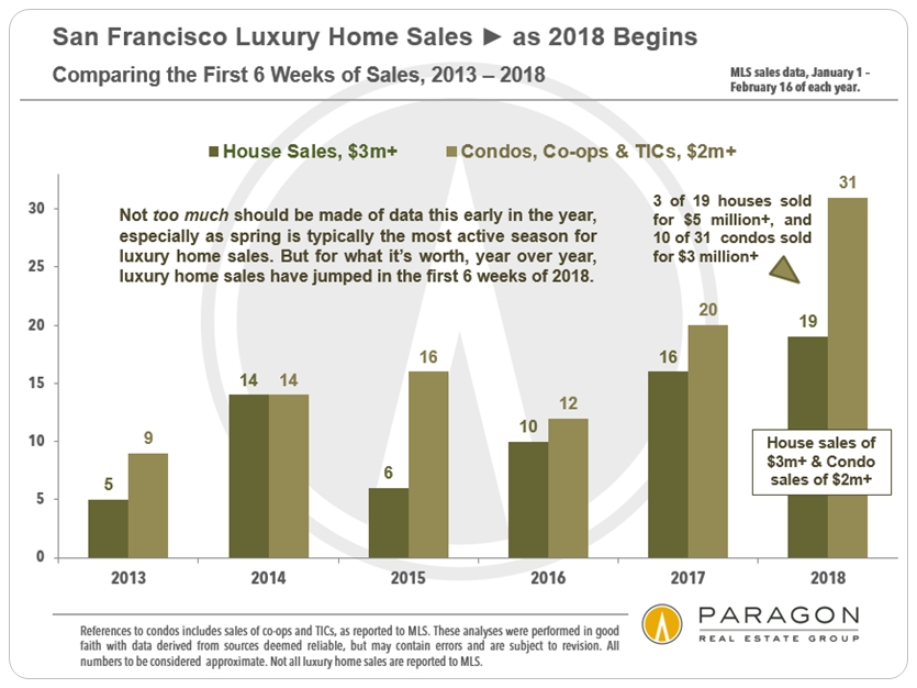
Year-over-Year Sales Comparisons First 6 Weeks of the Year
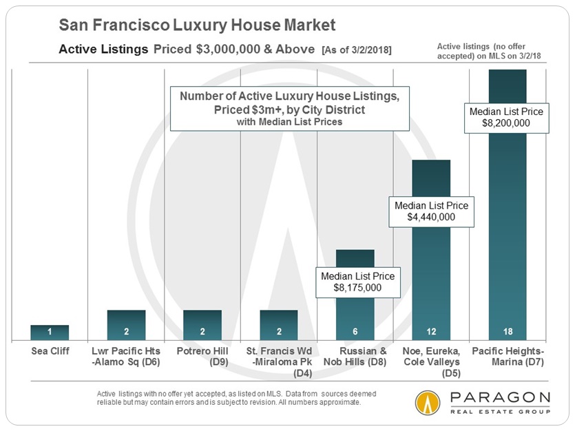
Active Luxury House Listings by District
SF Luxury House Sales by Era of Construction

Active Luxury Condo & Co-op Listings by District

Supply & Demand: Ultra-Luxury Condos & Co-ops

Long-Term Trends in Inventory
Only about 2% of house owners are putting their homes on the market each year, which is incredibly low by historical measures. About 5% of condo owners sell their homes each year, plus the new-construction condos that come on the market. This dynamic has made houses into the scarce commodity, and has fueled dramatic house price appreciation.
New Listings Coming on Market Long-Term Trends

Active Listings on Market at End of Month Long-Term Trends

Short-Term Trends: Seasonality
We are just heading now into the biggest sales season of the year, running from March through mid-June. The real estate market in the city is significantly affected by seasonality, and the luxury segment is even more fiercely affected. We shall also see if rising interest rates (if they continue to rise) or the changes in the federal tax law start to have any significant dampening effects on demand.
Listings Accepting Offers (Going into Contract) General Market

New Listings Coming on Market Luxury Home Market

Selected Supply & Demand Statistics
The following charts illustrate 3 of the classic indicators of market heat, and all of them speak to the feverish real estate market we have seen so far in 2018. However, the market is clearly hottest in the non-luxury price segment, and cooler in the highest price ranges, which is illustrated in the fourth chart below.
Average Days on Market Year-over-Year Comparisons

Percentage of Listings Accepting Offers by Month

Months Supply of Inventory (MSI) Year-over-Year Comparisons

Months Supply of Inventory (MSI) by Property Type & Price Segment
The market is softer in the highest price ranges
especially for the most expensive condos

Average $/Sq.Ft. Value by House Size
All things being equal, house size and price per square foot go in opposite directions, i.e. a smaller house will sell for a lower sales price but a higher dollar per square foot value. This has to do with land value and the cost of systems, kitchens and baths. This is why, comparing two periods of time, it is possible that median sales prices can go up while dollar per square foot values go down, or there is a significant mismatch in the appreciation rates - the average size of the houses sold significantly changed between the periods, which happens sometimes. The charts below are of 2 districts with both a good number of sales and relatively homogenous values within the district.
In both the cases below, the difference in price per square foot between smaller houses and the largest houses runs about $200, a 15% to 20% difference.


The above effect does not always apply: For example, in Pacific Heights, the biggest houses are also often in the most prestigious locations with the best views, and so command a premium in price per square foot despite their size. And this often does not apply to condo sales, because bigger units are often built higher up in the building, with more expensive finishes, delivering better (or staggering) views, and thus selling for higher $/sq.ft. values.
Rising Mortgage Interest Rates
Short-Term Trends
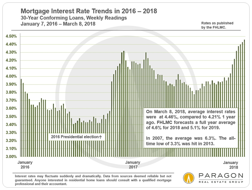
Long-Term Trends

Debt in America
One of the macro-economic factors of concern is that debt levels, of virtually every kind, are hitting new highs in the country (and in the world). This has been heavily subsidized by the historically low interest rates prevailing in recent years, but rates appear to be headed upward, and increasing debt often plays a big role in market cycles.
Debt Taken On to Invest in Financial Markets
(Often a Sign of Investor Over-Exuberance)

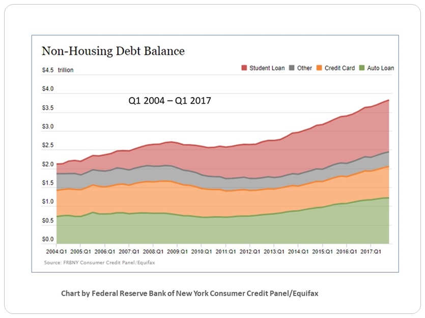
Household Non-Housing Debt
Credit Cards, Student Loans, Car Financing
Household Mortgage Debt Service Ratio
The amount of total mortgage debt in the country is now about the same as at its last peak in 2008 (not illustrated on this chart), but because of the plunge in interest rates since then, the ratio of mortgage debt service to disposable income was close to an all-time low in mid-2017. Interest rates have been rising since then, but are still about 30% lower than in 2007. The good news is that so much of mortgage debt in America is now in fixed-rate loans at very low interest rates, which adds much stability to economic conditions, a stability grievously lacking at the time of the 2008 financial markets crash.
